

Case Story
Complexity Creep and The Cost of Concensus:
Redesigning The Job Seeker Apply Flow at Monster
- Role
- UX Lead + Information Architect
- Teams
- Seeker UX with Engineering ( Maynard and Prague ) and Product Management
- Timeframe
- 2007 - 2009
- Focus Areas
- Design Team Project Management, UX Design, Information Architecture, Research, Strategic Collaboration, Feature Design
- Key Contributions
-
- Led UX redesign of the Job Seeker ‘Apply’ workflow
- Coordinated and facilitated internal cross-team reviews
- Explored and socialized alternative workflows to reduce risk
- Advocated for user-centered practices across teams
- Design Impact
-
- Reduced ‘Apply’ actions from multiple buttons to one focused entry point
- Unified multiple application workflows into a consistent experience
- Created a standardized Apply process across diverse job types
- Strategic Impact
-
- Introduced a post-Apply engagement loop, increasing session-level application completions
- Designed a recommendation engine to serve both the engagement loop and 404 scenarios
Client
Monster — https://monster.com — Maynard, Massachusetts
A pioneer in online recruiting for over 30 years, Monster.com helped employers and job seekers connect through a global platform supported by intelligent digital, social, and mobile tools.
Background
In 2007, I returned to Monster as a UX Lead on the Job Seeker Experience Design and Research Team. Under new leadership, the company launched Project Redux — a comprehensive redesign of the Job Seeker experience.
As part of Redux, I led UX efforts on several foundational features, including Sign In/Sign Up, the first Job Seeker Dashboard, and the Apply workflow—one of the most critical points for user success and business value.

Process
Design Studio Workshops
Strategy, Development & Facilitation
I developed and facilitated cross-functional workshops to capture team-wide knowledge, uncover hidden insights, and align on goals. These sessions brought together product managers, engineers, researchers, and content specialists, forming a shared understanding of the problem space.
Weekly working sessions in our dedicated “Obeya” design space allowed us to map, card sort, sketch, and prototype collaboratively. I guided the process from vision to iteration, keeping the team focused on user-centered solutions.
Design Explorations
We explored two distinct concepts for the new Apply workflow:
Apply in a Panel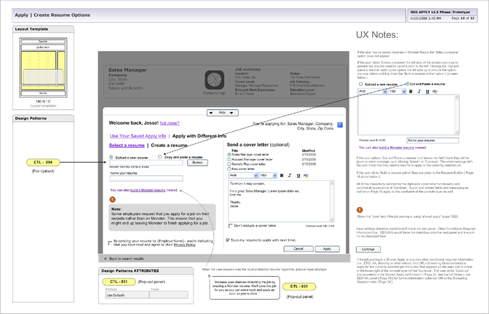
Based on a pattern recently adopted by Monster’s EU team, this approach opened a slide-up panel triggered by the Apply button. It reflected the engineering trends of the time (DHTML, Ajax), but I identified potential usability risks, including user disorientation and interaction fatigue.
Side-by-Side, All-in-One Screen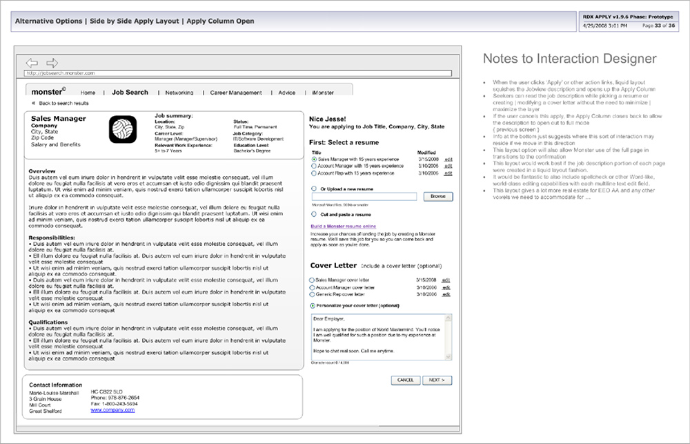
I proposed an alternative a split-screen layout that placed the application form beside the job description, maintaining context and reducing friction—especially for users comparing roles or needing to reference details to the job description information while applying.
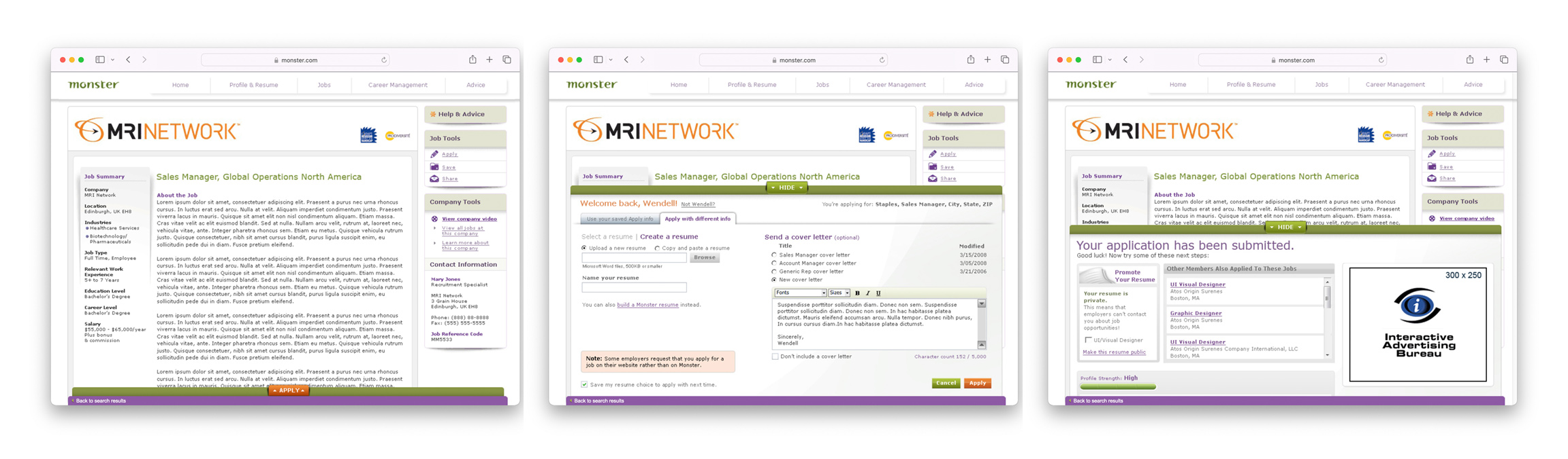
Final Design & Implementation
Despite my recommendations, leadership chose to move forward with the panel-driven design. I documented usability concerns and presented them to senior UX and product leaders, while ensuring that the chosen design was executed with the highest possible quality within technical constraints.
I also preserved the side-by-side concept for future testing—anticipating potential issues that later emerged.
Outcomes & Lessons Learned
Upon release, analytics showed the panel-based design underperformed: application completions dropped, and abandonment increased due to technical instability and interaction friction.
The team revisited my earlier side-by-side concept. Once implemented, it significantly improved key metrics: completions rebounded, and abandonment rates decreased.
Key Takeaways:
- Validate final implementations, not just prototypes—assumptions often fail at launch.
- Continuous testing reduces risk; usability isn’t a phase but a mindset.
- Simple, context-preserving solutions often out-perform more complex ones.
- Documenting and advocating for alternative ideas can enable better decisions at the appropriate time.